Charting

Contents
LINGO has a number of features to generate charts of your data. Chart types currently included are Bar, Bubble, Contour, Curve, Gantt, Histogram, Line, Network (node based and arc based), Pie, Radar, Scatter, Stacked Bar, Surface and Tornado. A description of the functions for each of the various chart types follows.
@CHARTBAR( 'TITLE', ' LABEL', 'Y-AXIS LABEL', 'LEGEND1', ATTRIBUTE1[, ..., 'LEGENDN', ATTRIBUTEN]);
@CHARTBAR will generate a bar chart of one or more attributes. The bar chart will be displayed in a new window. @CHARTBAR argument descriptions follow:
| • | TITLE - This is the title to display at the top of the chart. The title must be in quotes. |
| • | X-AXIS LABEL - The x-axis label in quotes. |
| • | Y-AXIS LABEL - The y-axis label in quotes. |
| • | LEGENDi - The legend to be used to label attribute i in quotes. |
| • | ATTRIBUTEi - This is the attribute to chart. At least one attribute argument must appear. If multiple attributes appear, the bars will be grouped together. |
As an example, consider the following model, CHARTSTAFF, which is a modified version of the staff scheduling example presented in section Primitive Set Example in Chapter 2, Using Sets:
MODEL:
SETS:
DAYS: REQUIRED, START, ONDUTY;
ENDSETS
DATA:
DAYS = MON TUE WED THU FRI SAT SUN;
REQUIRED = 23 16 13 16 19 14 12;
ENDDATA
SUBMODEL MODSTAFF:
MIN = @SUM( DAYS( I): START( I));
@FOR( DAYS( J):
ONDUTY( J) =
@SUM( DAYS( I) | I #LE# 5:
START( @WRAP( J - I + 1, 7)));
ONDUTY( J) >= REQUIRED( J)
);
ENDSUBMODEL
CALC:
! Solve the staffing model;
@SOLVE( MODSTAFF);
! Bar chart of required vs. actual staffing;
@CHARTBAR(
'Staffing Example', !Chart title;
'Day', !X-Axis label;
'Employees', !Y-Axis label;
'Employees Required', !Legend 1;
REQUIRED, !Attribute 1;
'Employees On Duty', !Legend 2;
ONDUTY !Attribute 2;
);
ENDCALC
END
Model: CHARTSTAFF
Here, we've added a reference to @CHARTBAR to generate a bar chart of staffing requirements vs. staff on duty for each day of the week. Here's is the bar chart that is generated:
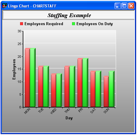
Note that since we specified more than one attribute, the bars for the two attributes for each day of the week are grouped together. LINGO also automatically labeled each bar using the attributes' parent set DAYS. From the chart it's easy to see that staffing requirements are just met on days Monday through Saturday, while on Sunday we have slightly more staffing than is actually required.
All arguments to charting function are optional, with the exception of the attribute values. In many cases, if an argument is omitted, LINGO will provide a reasonable default. For example, if the title is omitted as we have done here:
! Bar chart of required vs. actual staffing;
@CHARTBAR(
, !Chart title will default to file name;
'Day', !X-Axis label;
'Employees', !Y-Axis label;
'Employees Required', !Legend 1;
REQUIRED, !Attribute 1;
'Employees On Duty', !Legend 2;
ONDUTY !Attribute 2;
);
then LINGO will use the model's file name instead. Note that you must still include the comma separator when omitting an argument.
The complete list of charting functions supported is given in the table below. You may also be interested in running the CHARTS.LG4 sample model, which generates examples of all the chart types.
Chart Type |
Syntax |
Notes |
Bar |
@CHARTBAR( 'Title', 'X-Axis Label', 'Y-Axis Label', 'Legend1', Attribute1[, ..., 'Legendn', Attributen]); |
Multiple attributes will result in bars being grouped. See below for stacked bar charts. |
Bubble |
@CHARTBUBBLE( 'Title', 'X-Axis Label', 'Y-Axis Label', 'Legend1', X1, Y1, Size1,[, ..., 'Legendn', Xn, Yn, Sizen]); |
Each series of bubbles is represented as a triplet of (x-location, y-location, bubble size). |
Contour |
@CHARTCONTOUR( 'Title', 'X-Axis Label', 'Y-Axis Label', 'Legend', X, Y, Z); |
You can thinks of a contour chart as a 3-dimensional surface chart compressed into two dimensions. Only one series is allowed and it is represented by a grid (x,y,z) coordinates. |
Curve |
@CHARTCURVE( 'Title', 'X-Axis Label', 'Y-Axis Label', 'Legend1', X1, Y1[, ..., 'Legendn, Xn, Yn]); |
Curves are good for representing two-dimensional (x,y) plots, e.g., y=sin(x) . Multiples curves may be drawn in a single chart, with each curve represented as a series of (x,y) coordinates. See the sample model CHARTDISTRO for an example of a curve chart. |
Gantt |
@CHARTGANTT( 'Title', 'X-Axis Label', 'Y-Axis', StartTimes, EndTimes); |
Gantt charts are another form of a vertical bar chart. They are useful when planning and implementing projects consisting of many interdependent tasks. They do this by helping one to get an overview of the entire project and when all the various tasks of the project can start and how long they can run. The start and end times are defined on a 3-dimensional, derived set giving the assignment number, team and task of an assignment. More than one team may be working on one assignment, so the number of assignment may exceed the number of tasks. The start and end times also must be converted to LINGO's standard time with the @YMD2STM function. A example of a Gantt chart for project planning is show below. |
Histogram |
@CHARTHISTO( 'Title', 'X-Axis Label', 'Y-Axis', 'Legend', Bins, X); |
If the bin count, Bins, is omitted, LINGO will automatically compute a number of bins that results in a reasonably distributed histogram. Only one histogram may be displayed per chart. |
Line |
@CHARTLINE( 'Title', 'X-Axis Label', 'Y-Axis Label', 'Legend1', X1[, ..., 'Legendn', Xn]); |
Multiple lines can be displayed on a single chart, with each being drawn in a different color. |
Netarc |
@CHARTNETARC( 'Title', 'X-Axis', 'Y-Axis', 'Legend1', X1, Y1, X2, Y2[, ..., 'Legendn', X1n, Y1n, X2n, Y2n]); |
Netarc charts are network charts, where the network is represented by a list of 4-tuples, (x1,y1,x2,y2), where (x1,y1)-i is one end point of arc i and (x2,y2)-i is the other end point of arc i. Multiple networks may be displayed on a single chart. An optional fifth argument may be added to a data series to specify whether an arc should display an arrowhead, or not. For example, our first data series on the left is: X1, Y1, X2, Y2. We could have added a fifth argument, say A1: X1, Y1, X2, Y2, A1, where A1 is a vector of length equal to the number of arcs. Each member of A1 should then be set to one of the following values: 0: Undirected arc with no arrow, 1: Arc points from first to second node, 2: Arc points from second to first node, or 3: Bidirectional arc with arrow at both ends. |
Netnode |
@CHARTNETNODE( 'Title', 'X-Axis Label', 'Y-Axis' Label, 'Legend1', X1, Y1, I1, J1[, ..., 'Legendn', Xn, Yn, In, Jn]); |
Netnode charts are network charts, where the network is represented by a two lists of 2-tuples, (x,y) and (i,j), where the (x,y) are the coordinates of each node in the network and the (i,j) give the indices of two nodes from the (x,y) list that exist as an arc in the network. Multiple networks may be displayed on a single chart. An optional fifth argument may be added to a data series to specify whether an arc should display an arrowhead, or not. For example, our first data series on the left is: X1, Y1, I1, J1. We could have added a fifth argument, say A1: X1, Y1, I1, J1, A1, where A1 is a vector of length equal to the number of arcs. Each member of A1 should then be set to one of the following values: 0: Undirected arc with no arrow, 1: Arc points from first to second node, 2: Arc points from second to first node, or 3: Bidirectional arc with arrow at both ends. |
Pie |
@CHARTPIE( 'Title', 'Legend', X); |
Only one attribute may be displayed in a pie chart. |
Radar |
@CHARTRADAR( 'Title', 'Legend1', X1[, ..., 'Legendn', Xn]); |
Multiple attributes can be displayed, with each being in a different color. |
Scatter |
@CHARTSCATTER( 'Title', 'X-Axis Label', 'Y-Axis Label', 'Legend1', X1, Y1[, ..., 'Legendn', Xn, Yn]); |
Each scatter plot is represented by a list of (x,y) coordinates giving the location of each point in the scatter. Multiple scatter plots can be displayed in a single chart, with each being in a different color. |
Spacetime |
@CHARTSPACETIME( 'Title', 'X-Axis Label', 'Y-Axis Label', 'Legend1', ARC1, TIME1, TIME2, [, ..., 'Legendn', ARCn, TIME1n, TIME2n]); |
Spacetime charts are useful in visualizing the changes within a system over time, e.g., an airline's flights during some period of time. Time is typically measured on the x-axis and there are arcs representing movements or changes within the system over time. The ARC argument is a 3-dimensional set of arcs. The first dimension is the arc label/name, the second dimension store the origination point, while the final dimension store the arc destination. TIME1 and TIME2 store the start and end times for each arc. Multiple spacetime series may be plotted on the same chart. The sample model CHARTSPACETIME is an example of a spacetime chart for an airline schedule. In this example, the cities in the schedule are listed on the y-axis, and each arc represents a scheduled flight. |
Stacked Horizontal and Vertical Bar |
@CHARTSHBAR( 'Title', 'X-Axis Label', 'Y-Axis Label', 'Legend1', DataTable); @CHARTSVBAR( 'Title', 'Y-Axis Label', 'X-Axis Label', 'Legend1', DataTable); |
These bar charts will stack bar segments on top of one another, either horizontally or vertically. Data for the bars is specified in a 2-dimensional attribute. Each column represents one stacked bar. So, if your data table has three columns and five rows, then the chart will have three bars, each with 5 segments. This is similar to the way Excel handles stacked bars. The chart's legend, which gives the names of the bar segments, is automatically taken from the set name of the primitive set forming the first dimension of the data table's parent set. Note that when you display a horizontal chart, the x-axis will technically be on the y-axis. This is because the chart has been rotated 90 degrees, with the x-axis now running vertically. Please refer to the LINGO sample model, CHARTSTACKEDBAR for an example of stacked bar charts. |
Surface |
@CHARTSURFACE( 'Title', 'X-Axis Label', 'Y-Axis Label', 'Z-Axis Label', 'Legend', X, Y, Z); |
Each surface plot is represented by a list of (x,y,z) coordinates, each containing the location of a points on the surface. A sufficient number of points should be included to avoid excessive interpolation between points. Only one surface may be drawn on a chart. See the sample model CHARTSURF below for an example of a surface chart. |
Tornado |
@CHARTTORNADO( 'Title', 'X-Axis Label', 'Y-Axis Label', Base, 'Legend High', High, 'Legend Low', Low); |
A tornado chart is represented by a list of (high, low) pairs, giving the two extreme outcomes for a particular property (say profit) subject to changes in a particular parameter (say price). The base value is a single value for the property of interest given normal, or expected values, for each of the parameters. This is represented by one horizontal bar for each parameter, centered around the base value. The bars are then sorted by their lengths, giving the chart the appearance of a tornado. Tornado charts are useful for visualizing the sensitivity of a particular property to changes in a number of parameters. An example can be found in the LINGO sample models folder under the name ASTROCOSTRNDO. |
Surface Chart Example
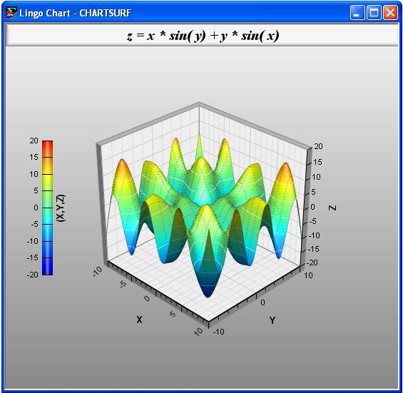
As another example, we will show how to create a surface chart by supplying a grid of (x,y,z) points lying on the surface: z = x * sin( y) + y * sin( x) using the following model, CHARTSURF:
MODEL:
! Creates a surface chart of z = x * sin( y) + y * sin( x);
SETS:
!Set up a 21x21 grid of (X,Y,Z) points on the surface;
SURF1 /1..21/;
SURF2( SURF1, SURF1): X, Y, Z;
ENDSETS
CALC:
!First point;
XS = @FLOOR( - (@SIZE( SURF1) / 2) + .5);
YS = XS;
!Generate remaining points and compute z;
@FOR( SURF2( I, J):
X( I, J) = XS + I - 1;
Y( I, J) = YS + J - 1;
Z( I, J) = X( I, J) * @SIN( Y( I, J)) + Y( I, J ) * @SIN( X( I, J));
);
!Create the chart;
@CHARTSURFACE(
'z = x * sin( y) + y * sin( x)', !Title;
'X', 'Y', 'Z', !Axis labels;
'(X,Y,Z)', !Legend;
X, Y, Z !Points on the surface;
);
ENDCALC
END
Model: CHARTSURF
First off, the CHARTSURF creates a 21x21 grid of points on the (X,Y) plane centered around (0,0) and computes Z for each of these points:
!First point;
XS = @FLOOR( - (@SIZE( SURF1) / 2) + .5);
YS = XS;
!Generate remaining points and compute z;
@FOR( SURF2( I, J):
X( I, J) = XS + I - 1;
Y( I, J) = YS + J - 1;
Z( I, J) = X( I, J) * @SIN( Y( I, J)) + Y( I, J ) * @SIN( X( I, J));
);
We then use the @CHARTSURFACE function to create the surface chart:
!Create the chart;
@CHARTSURFACE(
'z = x * sin( y) + y * sin( x)', !Title;
'X', 'Y', 'Z', !Axis labels;
'(X,Y,Z)', !Legend;
X, Y, Z !Points on the surface;
);
The resulting chart will appear as follows:
Gantt Chart Example
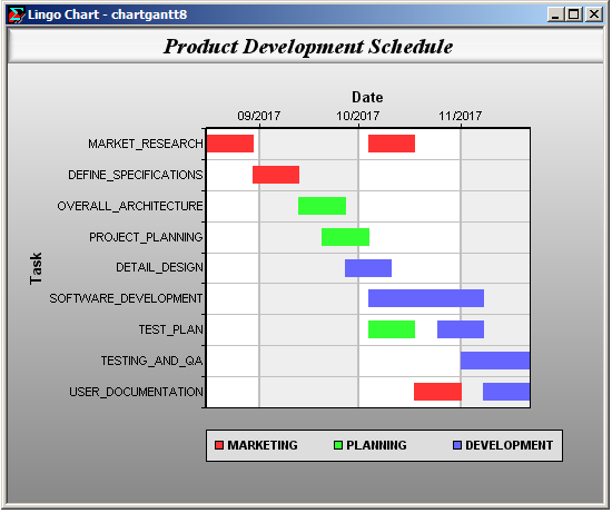
In this next example, we will show how to create a Gantt chart showing a project that will bring a software package to market. This example can be found in your LINGO samples folder under the name CHARTGANT.
The sets section for this model follows:
SETS:
TEAMS;
TASKS;
ASSIGNMENTS;
TTA( ASSIGNMENTS, TEAMS, TASKS):
START_YR, START_MO, START_DAY,
END_YR, END_MO, END_DAY,
START_STM, END_STM;
ENDSETS
Our primitive sets are TEAMS, TASKS and ASSIGNMENTS. There are three teams: Marketing, Planning and Development, that will be working on the nine tasks of the project. Some teams may be assigned to more than one task, as well as some tasks may be assigned to more than one team. Given this, the project may have more (team,task) assignment pairs than the number of tasks. In this project, there will be a total of 12 (team,task) assignments. Here are the team, task and assignment sets:
TEAMS =
Marketing
Planning
Development
;
TASKS =
Market_Research
Define_Specifications
Overall_Architecture
Project_Planning
Detail_Design
Software_Development
Test_Plan
Testing_and_QA
User_Documentation
;
ASSIGNMENTS = 1..12;
The set TTA is a derived set, derived from the three primitive sets. It's used to store the 12 (team,task) assignments. We also define attributes on TTA to store starting and ending times for each (team,task) assignment. Here is the initialization of TTA and its attributes:
TTA, START_YR, START_MO, START_DAY, END_YR, END_MO, END_DAY =
1 Marketing Market_Research 2017 8 16 2017 8 30
2 Marketing Market_Research 2017 10 4 2017 10 18
3 Marketing Define_Specifications 2017 8 30 2017 9 13
4 Planning Overall_Architecture 2017 9 13 2017 9 27
5 Planning Project_Planning 2017 9 20 2017 10 4
6 Development Detail_Design 2017 9 27 2017 10 11
7 Development Software_Development 2017 10 4 2017 11 8
8 Planning Test_Plan 2017 10 4 2017 10 18
9 Development Test_Plan 2017 10 25 2017 11 8
10 Development Testing_and_QA 2017 11 1 2017 11 22
11 Marketing User_Documentation 2017 10 18 2017 11 1
12 Development User_Documentation 2017 11 8 2017 11 22
;
Here we see that the first (team,task) assignment has Marketing working on the Market Research task from 8/16/2017 to 8/30/2017.
The Gantt chart routine requires that dates be passed in LINGO's standard time format, so we convert the dates above to standard time in the calc section using the @YMD2STM function:
@FOR( TTA( ASG, TM, TK):
START_STM( ASG, TM, TK) =
@YMD2STM( START_YR( ASG, TM, TK), START_MO( ASG, TM, TK),
START_DAY( ASG, TM, TK) , 0, 0, 0);
END_STM( ASG, TM, TK) =
@YMD2STM( END_YR( ASG, TM, TK), END_MO( ASG, TM, TK),
END_DAY( ASG, TM, TK) , 0, 0, 0);
);
At this point, everything is set to create the chart, which we do with the following statement:
@CHARTGANTT( 'Product Development Schedule', 'Date',
'Step', START_STM, END_STM);
Note that we don't explicitly pass the TTA set. LINGO infers that TTA contains the assignment information given that it is the parent set of the start and end time attributes. LINGO also retrieves the task names from the TTA set. The chart appears as follows:
Simplified Chart Function Formats
Some of the chart functions above support a simplified format where all the arguments, with the exception of the data attributes, are omitted. For instance, in the bar chart example above, we could have simply used the following:
! Bar chart of required vs. actual staffing;
@CHARTBAR( REQUIRED, ONDUTY);
In which case, the resulting chart would be:
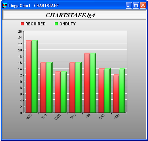
Note the following differences between the charts created using the simplified chart format and the example above where we specified all the arguments:
| • | The chart title is now the file name. |
| • | The legends are simply the names of the attributes. |
| • | The X and Y axis labels have been omitted. |
The simplified syntax for each of the charting functions appears below:
Chart Type |
Simplified Syntax |
Bar |
@CHARTBAR( Attribute1[, ..., Attributen]); |
Bubble |
@CHARTBUBBLE( X1, Y1, Size1,[, ..., Xn, Yn, Sizen]); |
Contour |
@CHARTCONTOUR( X, Y, Z); |
Curve |
@CHARTCURVE( X1, Y1[, ..., Xn, Yn]); |
Histogram |
@CHARTHISTO( X); |
Line |
@CHARTLINE( X1[, ..., Xn]); |
Netarc |
@CHARTNETARC( X1, Y1, X2, Y2[, ..., X1n, Y1n, X2n, Y2n]); |
Netnode |
@CHARTNETNODE( X1, Y1, I1, J1[, ..., Xn, Yn, In, Jn]); |
Pie |
@CHARTPIE( X); |
Radar |
@CHARTRADAR( X1[, ..., Xn]); |
Scatter |
@CHARTSCATTER( X1, Y1[, ..., Xn, Yn]); |
Surface |
@CHARTSURFACE( X, Y, Z); |
Tornado |
@CHARTTORNADO( Base, High, Low); |
Using Procedures to Specify Chart Points
For curve, surface and contour charts, you may use a procedure to specify the function to be plotted. LINGO will automatically call this procedure to generate function points for the chart, thereby allowing you to skip the step of explicitly generating the points. The syntax for these procedure based charting functions is as follows:
Chart Type |
Syntax |
Contour |
@CHARTPCONTOUR( 'Title', 'X-Axis Label', 'Y-Axis Label', 'Z-Axis Label', PROCEDURE, X, XL, XU, Y, YL, YU, 'Legend', Z); |
Curve |
@CHARTPCURVE( 'Title', 'X-Axis Label', 'Y-Axis Label', PROCEDURE, X, XL, XU, 'Legend1', Y1[, ...,'LegendN', YN]); |
Surface |
@CHARTPSURFACE( 'Title', 'X-Axis Label', 'Y-Axis Label', 'Z-Axis Label', PROCEDURE, X, XL, XU, Y, YL, YU, 'Legend', Z); |
In the case of the two-dimensional curve chart, the PROCEDURE argument is the name of the procedure containing the formula for the curve, X is the independent variables, XL and XU its upper and lower bounds and Y1 is the dependent variable that gets assigned the function's value. The three-dimensional contour and surface charts have two independent variables (X and Y) and the dependent variable Z. As an example, the model below uses the @CHARTPSURFACE function to generate the same surface chart presented above:
MODEL:
! Creates surface chart of z = x * sin( y) + y * sin( x);
! Function points are provided by the WAVE procedure;
PROCEDURE WAVE:
Z = X * @SIN( Y) + Y * @SIN( X);
ENDPROCEDURE
CALC:
B = 10;
@CHARTPSURFACE(
'z = x * sin( y) + y * sin( x)', !Title;
'X','Y','Z', !Axis labels;
WAVE, !Procedure name;
X, -B, B, !Independent var 1 and its bounds;
Y, -B, B, !Independent var 2 and its bounds;
'Z', !Legend;
Z !Dependent var/function value;
);
ENDCALC
END
Model: CHARTPSURF
| Note: | Charting capabilities are only available in the interactive versions of LINGO. If you are using the LINGO API and need a charting capability, then you should investigate third-party solutions or use charting tools available in your development environment. |